Lecture 3
Duke University
STA 199 - Fall 2026
August 31, 2026
1. Clone your ae repository
Go to the course GitHub organization and clone ae-YOUR-GITHUB-NAME repo to your Positron session in your container.
2. Participate 📱💻
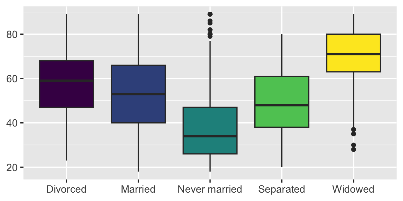
Remember this visualization from the code along video – what was it about?
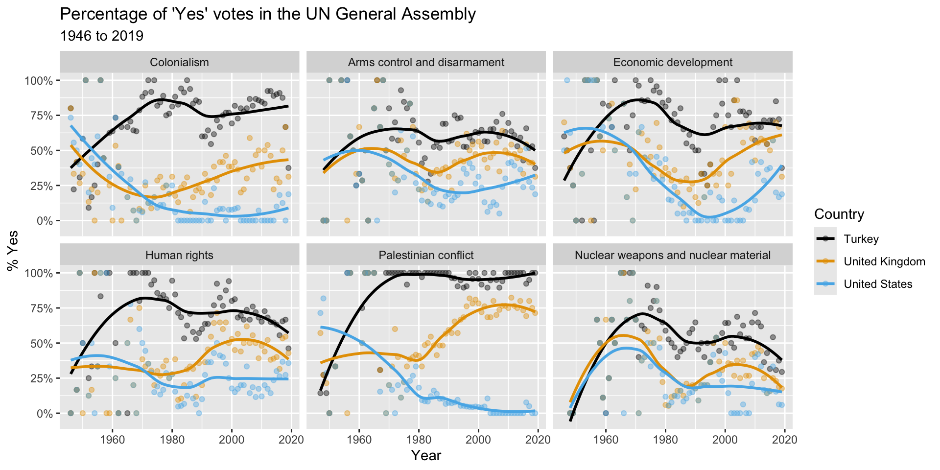

Go to wooclap.com and use the code IOAADOR.
Last week:
We introduced you to the course toolkit.
You cloned your lab repository and started making some updates in your Quarto documents.
You committed and pushed your changes back – at least most of you did!
Today:
You will clone your ae (application exercise) repository.
We will introduce data visualization.
You will work on the application exercise on data visualization, commit your changes, and push them.
Reminder
tidyverse is the collection of R packages designed for data science.
Reminder
We can read this as “read the CSV file called gss-2024.csv in the data folder” and save the result as gss.
GSS is a widely respected, nationally representative sociological survey that tracks how American opinions, attitudes, and behaviors change over time.
We’re working with GSS data from the most recent wave:
Note
The GSS is a cross-sectional survey. We can describe associations, but these data do not establish causation.
# A tibble: 3,294 × 9
year marital_status age education_years children happiness health
<dbl> <chr> <dbl> <dbl> <dbl> <chr> <chr>
1 2024 Never married 33 16 2 Not too happy Good
2 2024 Never married 64 16 0 Pretty happy Good
3 2024 Married 69 14 0 Pretty happy Good
4 2024 Never married 19 12 0 Pretty happy Good
5 2024 Divorced 70 13 3 Not too happy Good
6 2024 Married 53 14 2 Pretty happy Good
7 2024 Married 48 13 6 Pretty happy Good
8 2024 Divorced 30 14 1 Not too happy Good
9 2024 Married 60 14 2 Very happy Good
10 2024 Never married 25 12 0 Pretty happy Good
# ℹ 3,284 more rows
# ℹ 2 more variables: employment_status <chr>, party_id <chr>
| Variable | Description | Type |
|---|---|---|
marital_status |
Current marital status | Categorical |
age |
Age in years | Numerical |
education_years |
Completed years of education | Numerical |
children |
Number of children; 8 means 8 or more | Numerical |
happiness |
Self-reported happiness | Categorical |
health |
Self-reported general health | Categorical |
employment_status |
Current employment status | Categorical |
party_id |
Party identification | Categorical |
How does age vary across marital-status groups?
Before writing code:
ggplot(gss, aes(x = marital_status, y = age, fill = marital_status)) +
geom_boxplot(show.legend = FALSE) +
labs(
title = "Age varies substantially across marital-status groups",
x = "Marital status",
y = "Age (years)",
caption = "Source: 2024 General Social Survey (GSS), NORC"
) +
scale_fill_viridis_d()Warning: Removed 94 rows containing non-finite outside the scale range
(`stat_boxplot()`).
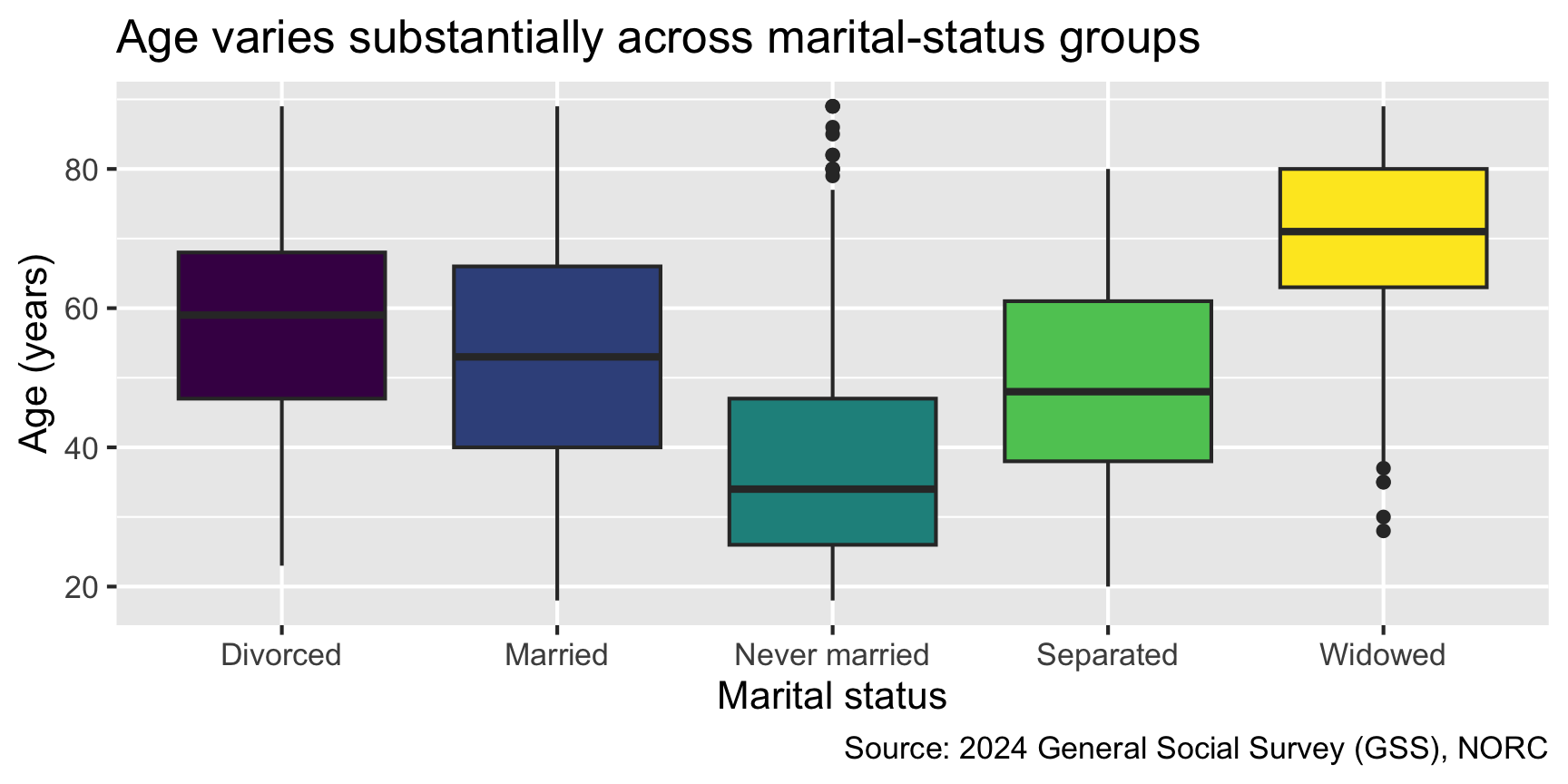
The plot was created, but R displayed the warning below. What happened to the 94 observations?

Go to wooclap.com and use the code IOAADOR.
With a partner:
ggplot(
1 data = gss,
2 mapping = aes(x = marital_status, y = age, fill = marital_status)
) +
3 geom_boxplot() +
4 labs(...) +
5 scale_fill_viridis_d()Which component would you change to plot different variables? Which component controls the variable represented by the fill color?
Aesthetics are visual properties such as position, color, fill, shape, size, and transparency.
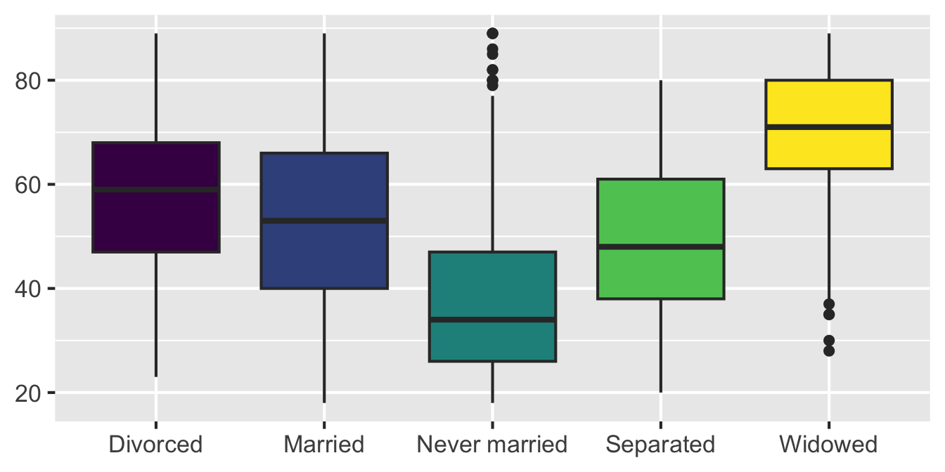
Map: fill varies with a variable, so ggplot2 creates a legend
Tip
Variables belong inside aes(); fixed visual choices belong outside it.
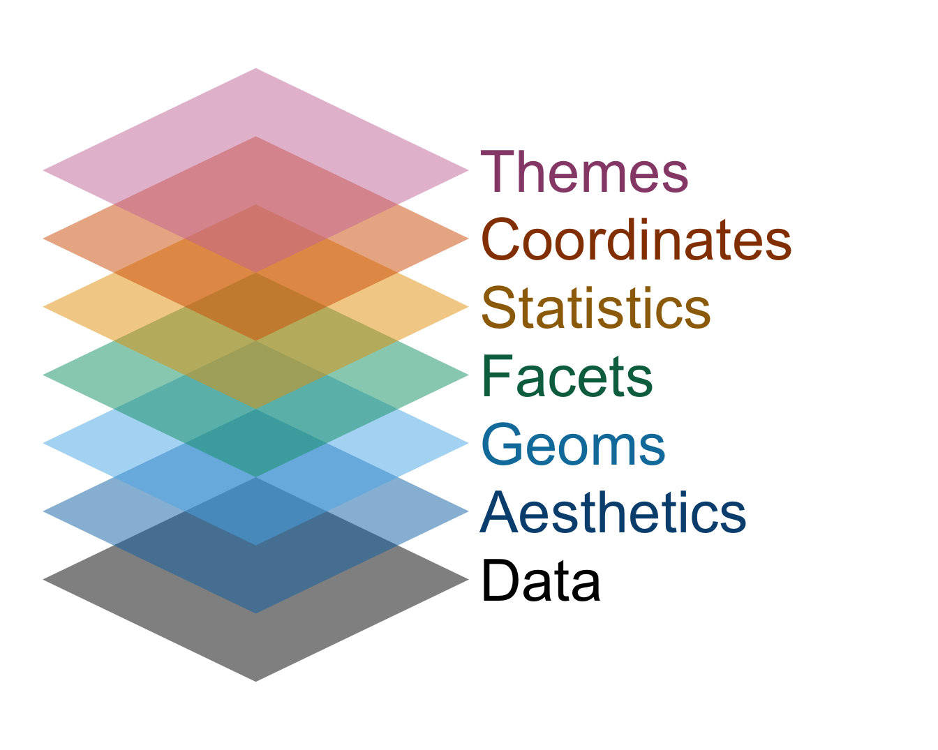
When building or reading a plot, work through the layers as if they’re a checklist.
Not every plot needs every component, but each component is a separate decision.

Go to the course GitHub organization and clone ae-YOUR-GITHUB-NAME repo to your Positron session in your container.
Open ae-01-gss-dataviz.qmd in Positron and follow the instructions to complete the application exercise.