AE 10: Mental distress with multiple predictors
In the previous application exercise, we used a linear regression model with one numerical predictor to study health outcomes across North Carolina counties. In this exercise, we will use both a numerical predictor and a categorical predictor to model frequent mental-distress prevalence. We will also investigate whether the relationship between loneliness and mental distress might differ by county development tier.
The data come from the CDC PLACES 2025 county release. PLACES provides model-based local health estimates for every U.S. county.
Getting started
Packages
We will use the tidyverse package for data visualization and wrangling, the tidymodels package for modeling, and the scales package for formatting percentages.
Data
The data can be found in the data folder; the file is called nc-places.csv.
nc_places <- read_csv("data/nc-places.csv")The variables used in this exercise are:
| Variable name | Description |
|---|---|
county |
North Carolina county name |
development_tier |
County development tier; Tier 1 is the most economically distressed and Tier 3 is the least economically distressed |
loneliness |
Percentage of adults reporting that they always, usually, or sometimes feel lonely |
mental_distress |
Percentage of adults experiencing frequent mental distress |
The percentage variables are age-adjusted, model-based estimates.
The main-effects model
So far, we fit the following main effects model:
md_tier_lone_main_fit <- linear_reg() |>
  fit(
    mental_distress ~ development_tier + loneliness,
    data = nc_places
  )

tidy(md_tier_lone_main_fit)
# A tibble: 4 × 5
term estimate std.error statistic p.value
<chr> <dbl> <dbl> <dbl> <dbl>
1 (Intercept) 6.04 2.06 2.93 0.00420
2 development_tierTier 2 -0.381 0.187 -2.04 0.0437
3 development_tierTier 3 -1.41 0.265 -5.33 0.000000651
4 loneliness 0.379 0.0583 6.50 0.00000000352- In this model, what assumption do we make about the relationship between loneliness and mental distress across the three development tiers?
Add your response here.
Could the slopes differ?
The following plot also fits a separate regression line for each development tier.
Remembering what each tier represents can be helpful:
- Tier 1: 40 most economically distressed counties
- Tier 2: next 40 counties
- Tier 3: 20 least economically distressed counties
ggplot(
  nc_places,
  aes(x = loneliness, y = mental_distress, color = development_tier)
) +
  geom_point(alpha = 0.7) +
  geom_smooth(method = "lm", se = FALSE) +
  scale_x_continuous(labels = label_percent(scale = 1)) +
  scale_y_continuous(labels = label_percent(scale = 1)) +
  scale_color_viridis_d(end = 0.85) +
  labs(
    x = "Adults experiencing loneliness (%)",
    y = "Adults experiencing frequent mental distress (%)",
    color = "Development tier"
  ) +
  theme(legend.position = "bottom")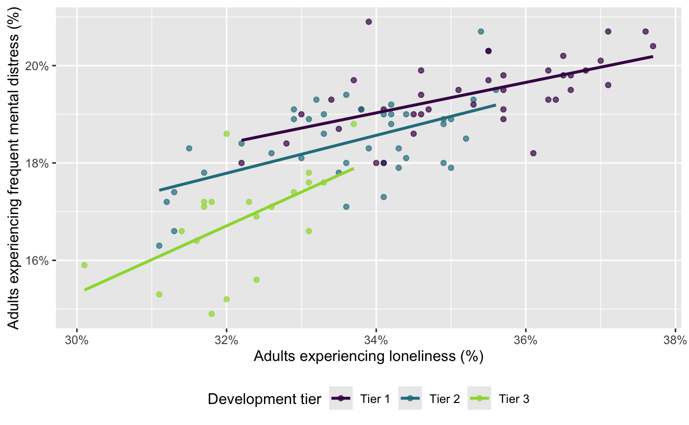
- How do these lines differ from the parallel fitted lines produced by the main effects model?
Add your response here.
Fitting an interaction model
An interaction effects model allows the slope for loneliness to differ across development tiers. In a model formula, development_tier * loneliness includes:
the main effect of
development_tier,the main effect of
loneliness, andtheir interaction.
Fit the interaction model and examine its coefficients. Name the model
md_tier_lone_int.
# add code here- Which development tier is the baseline level?
Add your response here.
Comparing the two models visually
- Set the following code cell’s
evaloption totrueto render the visualizations of main and interaction effect models. Describe what the code is doing.
md_tier_lone_main_aug <- augment(
  md_tier_lone_main_fit,
  new_data = nc_places
)

ggplot(
  md_tier_lone_main_aug,
  aes(x = loneliness, color = development_tier)
) +
  geom_point(aes(y = mental_distress), alpha = 0.5) +
  geom_line(aes(y = .pred), linewidth = 1) +
  scale_color_viridis_d(end = 0.85) +
  labs(
    x = "Loneliness (%)",
    y = "Mental distress (%)",
    color = "Development tier",
    title = "Main-effects model"
  ) +
  theme(legend.position = "bottom")

md_tier_lone_int_aug <- augment(
  md_tier_lone_int,
  new_data = nc_places
)

ggplot(
  md_tier_lone_int_aug,
  aes(x = loneliness, color = development_tier)
) +
  geom_point(aes(y = mental_distress), alpha = 0.5) +
  geom_line(aes(y = .pred), linewidth = 1) +
  scale_color_viridis_d(end = 0.85) +
  labs(
    x = "Loneliness (%)",
    y = "Mental distress (%)",
    color = "Development tier",
    title = "Interaction model"
  ) +
  theme(legend.position = "bottom")
Add your response here.
- Describe the key difference between the fitted lines in the two plots.
Add your response here.
- Which model makes the stronger assumption about the relationship between loneliness and mental distress? Explain.
Add your response here.
Interpreting the interaction model
- Write the fitted interaction model using mathematical notation. Your model should contain six coefficient estimates.
Add your response here.
- Write the model for Tier 1 counties using mathematical notation. Then, interpret the slope for loneliness in context.
Add your response here.
- Write the model for Tier 2 counties using mathematical notation. Then, interpret the slope for loneliness in context.
Add your response here.
- Write the model for Tier 3 counties using mathematical notation. Then, interpret the slope for loneliness in context.
Add your response here.
- In the interaction model, what does the intercept represent? Is its interpretation meaningful for these data?
Add your response here.
Comparing model fit
- Calculate the \(R^2\) and adjusted \(R^2\) for each model.
# add code here- Which model has the higher \(R^2\)? Why does adding interaction terms necessarily result in an \(R^2\) that is at least as high?
Add your response here.
- Which model has the higher adjusted \(R^2\)? Why is adjusted \(R^2\) more useful than \(R^2\) for this comparison?
Add your response here.
- How large is the difference in fit between the two models? Do you consider this difference practically meaningful?
Add your response here.
- Considering both model fit and simplicity, which model would you choose for predicting mental-distress prevalence? Justify your choice.
Add your response here.