HW 2
Wrangling and visualizing the Old North State
Introduction
North Carolina is often described as one state, but its 100 counties differ in population, geography, access to resources, and economic and educational opportunities. In this homework, you will use county-level data to get to know North Carolina through data visualization and data transformation.
The goal is not to rank counties or explain why one county is different from another. Instead, you will practice asking descriptive questions such as: How are counties organized? Where are the most densely populated counties? How common is broadband access across different types of counties? How does educational attainment vary across the state?
As you work, remember that each row represents a county, not an individual person. Your summaries will therefore describe counties in North Carolina, and your conclusions should use careful, non-causal language.
Learning objectives
By the end of this homework, you will:
- use
dplyrto count, filter, arrange, summarize, and create new variables; - use
ggplot2to visualize categorical and numerical variables; - describe distributions using shape, center, spread, and unusual observations; and
- use data to develop a more detailed understanding of variation among North Carolina counties.
Getting Started
Guidelines
The guidelines should feel familiar, as they are the same ones from the lab! They are included below as a reminder.
Code
Code should follow the tidyverse style. Particularly,
- there should be spaces before and line breaks after each
+when building aggplot, - there should also be spaces before and line breaks after each
|>in a data transformation pipeline, - code should be properly indented,
- there should be spaces around
=signs and spaces after commas.
Additionally, all code should be visible in the PDF output, i.e., should not run off the page on the PDF. Long lines that run off the page should be split across multiple lines with line breaks.
Plots
- Plots should have an informative title and, if needed, also a subtitle.
- Axes and legends should be labeled with both the variable name and its units (if applicable).
- Careful consideration should be given to aesthetic choices.
Workflow
Continuing to develop a sound workflow for reproducible data analysis is important as you complete the lab and other assignments in this course.
- You should have at least 3 commits with meaningful commit messages by the end of the assignment.
- Final versions of both your
.qmdfile and the rendered PDF should be pushed to GitHub.
AI support and feedback
You can get immediate support as well as feedback on all of the questions with AI, based on rubrics designed by the course instructor, via the Codex extension in Positron, and using AI access provided by Duke University.
When working on your assignment, feel free to ask Codex for help, but don’t ask it to do your work for you. After completing a question, ask Codex to provide feedback on your answer, e.g., “Review my answer for Question 1.”
If you have not yet enabled Duke’s ChatGPT Edu access or installed the Codex extension for Positron, follow the instructions in HW 1.
Packages and data
Packages
You will use:
- tidyverse package for data wrangling and visualization,
- scales for better axis labels, and
- ggbeeswarm for additional geoms.
Data
In this homework you will work with a dataset that contains information on North Carolina counties. Some columns of the data come from the 2020 Census and others from the 2026 Attainment Profiles data distributed as part of the myFutureNC Dashboard maintained by Carolina Demography at the University of North Carolina at Chapel Hill. These data were retrieved on September 5, 2026 from these two resources.
This dataset is stored in a file called nc-county.csv in the data folder of your repository.
The variables in the dataset and their descriptions are as follows:
| No. | Variable | Description |
|---|---|---|
| 1 | county |
Name of county. |
| 2 | land_area_m2 |
Land area of county in meters-squared, based on the 2020 census. |
| 3 | land_area_mi2 |
Land area of county in miles-squared, based on the 2020 census. |
| 4 | pop_2020 |
Population of county, based on the 2020 Census. |
| 5 | pop_dens_2020 |
Population density calculated as population (pop_2020) divided by land area in miles-squared (people per mile-squared). |
| 6 | county_type |
Peer county type classification based on population characteristics, socioeconomic status, and geographic features used for grouping counties with similar demographic, social, and economic characteristics, allowing them to be compared and benchmarked against one another. |
| 7 | median_hh_income |
Median household income. |
| 8 | p_foreign_born |
Percentage of population that is foreign-born. |
| 9 | p_child_poverty |
Percentage of children living in poverty. |
| 10 | p_single_parent_hh |
Percentage of households with children that are single-parent households. |
| 11 | p_broadband |
Percentage of households with broadband internet access. |
| 12 | p_home_ownership |
Percentage of homes that are owner-occupied. |
| 13 | p_family_sustaining_wage |
Percentage of adults that earn a family-sustaining wage – typically a wage that covers essential costs like housing, food, childcare, transportation, and healthcare for a family’s basic needs within a specific geographic area. |
| 14 | p_edu_lths |
Percentage of 25-44-year-olds with less than a high school diploma. |
| 15 | p_edu_hsged |
Percentage of 25-44-year-olds with a high school diploma or equivalent. |
| 16 | p_edu_scnd |
Percentage of 25-44-year-olds with some college. |
| 17 | p_edu_ndc |
Percentage of 25-44-year-olds with non-degree credentials – certifications, licenses, or other credentials that demonstrate specific skills or knowledge but do not confer a formal academic degree. |
| 18 | p_edu_assoc |
Percentage of 25-44-year-olds with an associate degree. |
| 19 | p_edu_ba |
Percentage of 25-44-year-olds with a bachelor’s degree. |
| 20 | p_edu_mapl |
Percentage of 25-44-year-olds with a master’s, professional, or doctoral degree. |
| 21 | p_edu_hs_grad_rate |
High school graduation rate. |
| 22 | p_edu_chronic_absent_rate |
Chronic absenteeism rate. |
Percentage variables, including variables whose names begin with p_, are stored as proportions from 0 to 1. For example, a value of 0.75 represents 75%. When reporting findings, convert these proportions to percentages when appropriate.
You can read this file into R with the following code:
nc_county <- read_csv("data/nc-county.csv")Questions
Question 1
We begin by getting an overview of how the counties in North Carolina are classified. This gives us a first sense of the balance between rural, suburban, and urban parts of the state.
Calculate the number of rows and columns in
nc_county.Calculate the number of counties in each
county_typeand display your results in descending order of the number of counties.Based on your findings so far, write a short, introductory paragraph describing the dataset.
Preview, commit, and push your changes to GitHub with the commit message “Added answer for Question 1”.
Make sure to commit and push all changed files so that your source control pane is empty afterward.
Question 2
North Carolina includes densely populated urban counties as well as counties with much more land and fewer residents. Before focusing on particular counties, summarize the overall distribution of population density.
Your goal is to describe the distribution of population density (pop_dens_2020) of North Carolina counties using the following sentence as:
The distribution of population density of North Carolina counties is ____. A typical North Carolina county has a population density of
_____people per square mile. The middle 50% of North Carolina counties have population densities between_____and_____people per square mile.
Figure out the words and values that should go into the blanks using data visualization(s) and summary statistics. Any summary statistics should be calculated in a single pipeline.
Think about which measures of center and spread are appropriate for a strongly right-skewed distribution.
Preview, commit, and push your changes to GitHub with the commit message “Added answer for Question 2”.
Make sure to commit and push all changed files so that your source control pane is empty afterward.
Question 3
Now use the population-density distribution to identify specific places at the densely populated end of the spectrum. As you look at the results, consider which counties you recognize and what their population density might suggest about where people live in North Carolina.
Answer each part using a single data-wrangling pipeline. Your response should be a data frame with the following five columns, in this order: county, county_type, pop_dens_2020, pop_2020, and land_area_mi2. If your response has multiple rows, arrange the counties in descending order of population density.
Find out which county Duke University is located in and identify its population density.
Identify all counties with a population density greater than 500 people per square mile. Find a map of North Carolina counties from a reliable source online and use it to identify the locations of these counties (e.g., eastern, western, central, or coastal North Carolina). Your response should link to the map you found as well.
Identify the county with the highest population density. Your code must use
max().
Preview, commit, and push your changes to GitHub with the commit message “Added answer for Question 3”.
Make sure to commit and push all changed files so that your source control pane is empty afterward.
Question 4
The number of people living in a county is one way to understand North Carolina, but economic opportunity is another. The following question helps identify which county types include several counties where a relatively large share of adults earn a family-sustaining wage.
A classmate says:
“Look at that, there is a county type containing at least ten counties where less than half of adults earn a family-sustaining wage!”
In a single pipeline, discover all county types that could fill in the blank. Your response should be a data frame with only the county type and the number of counties in that county type where p_family_sustaining_wage is less than 0.50, and by 1-2 sentences identifying the county types that satisfy the statement and the county types that do not.
Preview, commit, and push your changes to GitHub with the commit message “Added answer for Question 4”.
Make sure to commit and push all changed files so that your source control pane is empty afterward.
Question 5
Access to broadband internet is one part of the infrastructure that connects people to school, work, health information, and one another. Use the county data to explore whether broadband access appears to vary across the county types used in this dataset.
Do some county types have a higher percentage of counties where at least 75% of households have broadband internet access?
To explore this question, first create a new variable called
broadband_levelinnc_county. The variable should have the value"At least 75%"whenp_broadbandis greater than or equal to 0.75, and"Below 75%"otherwise.Then, create a segmented bar plot with one bar per
county_type, filled according tobroadband_level. The y-axis should range from 0 to 1 and represent the proportion of counties in each county type.Finally, in a single pipeline, calculate the proportion of counties with at least 75% broadband access for each
county_type.Based on the visualization and the summary statistics, write a short paragraph comparing the percentage of counties with at least 75% broadband access across the county types based on your plot.
Preview, commit, and push your changes to GitHub with the commit message “Added answer for Question 5”.
Make sure to commit and push all changed files so that your source control pane is empty afterward.
Question 6
We next turn to education, another important dimension of life. Specifically, we will examine the distribution of higher educational attainment across counties in North Carolina.
The dataset records several education categories separately. First, create a new variable called p_edu_he (short for “percentage with higher education”) that is the sum of the percentages of
- 25-44-year-olds with an associate degree (`p_edu_assoc`),
- a bachelor's degree (`p_edu_ba`), and
- a master's, professional, or doctoral degree (`p_edu_mapl`).
and store this variable in the nc_county data frame.
If you don’t create the new variable p_edu_he, you will not be able to answer the remaining parts of this question or any of the remaining questions on the homework.
Therefore, here is a quick check to make sure you created the variable correctly – after creating the variable, run the following code:
nc_county |>
  select(county, p_edu_he) |>
  slice_head(n = 3)
You should see the following output:
# A tibble: 3 × 2
  county    p_edu_he
  <chr>        <dbl>
1 Alamance     0.427
2 Alexander    0.308
3 Alleghany    0.342
These values are proportions: for example, 0.427 means that 42.7% of 25–44-year-olds in the county have an associate degree or higher.
If you do not see this output, please revisit the instructions above and make sure you created the variable correctly. Ask for help on Ed or in office hours if you need assistance.
-
In a single pipeline, calculate the
- minimum,
- first quartile (25th percentile),
- median (50th percentile),
- mean,
- third quartile (75th percentile), and
- maximum
of
p_edu_he. In a single pipeline, calculate the same statistics as in the previous part, but for each
county_type. Arrange the results in ascending order of median. Briefly comment on how these summary statistics vary across county types.
Preview, commit, and push your changes to GitHub with the commit message “Added answer for Question 6”.
Make sure to commit and push all changed files so that your source control pane is empty afterward.
Question 7
The summary statistics in Question 6 describe higher education numerically. This visualization lets you see how the full distributions differ across county types and which counties contribute to those distributions.
Using the variable you created in Question 6, re-create the following plot that shows the distribution of p_edu_he by county_type.
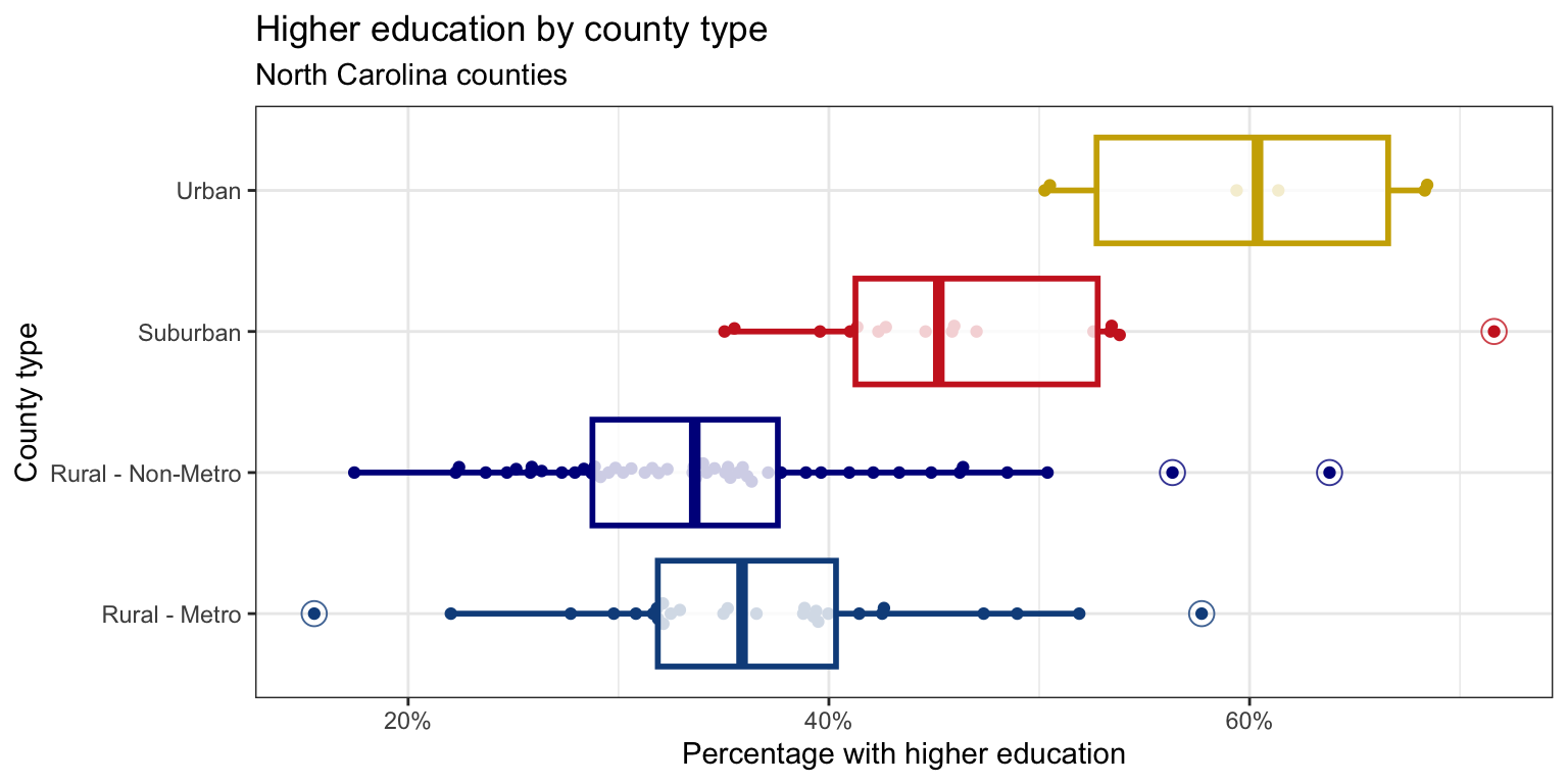
x-axis: You learned how to format the x-axis as percentages in class and had a hint about it in your previous homework assignment. You can use the same approach here.
Points: The points are drawn with the
geom_beeswarm()function from the ggbeeswarm package.Outliers: The outliers in the box plots are drawn as open circles. You can specify this with the
outlier.shapeargument ingeom_boxplot(). You can also adjust the size of the outliers with theoutlier.sizeargument. The ggplot2 aesthetic specifications documentation has a list of shape names you can use for help.Color palette: The colors for the box plots are manually specified in a
scale_color_manual()layer. You do not need to worry about the exact colors, but you should try to get close, e.g., use blue-ish colors for Rural counties, red-ish for Suburban, and brown-ish for Urban. You can use HEX codes for colors or look up named colors in R in the R colors cheatsheetTransparancy: You should adjust the transparency of the box plots. You don’t have to worry about the exact transparency value, but you should try to get close.
Theme: This plot uses a non-default theme. See theme options documentation for options.
Aspect ratio and width: You can adjust the aspect ratio and width of your plot in your rendered document by setting
fig-aspandfig-widthoptions in the code cell.
Preview, commit, and push your changes to GitHub with the commit message “Added answer for Question 7”.
Make sure to commit and push all changed files so that your source control pane is empty afterward.
Question 8
The points that fall beyond the typical range in the previous plot represent counties that may be especially useful for getting to know North Carolina. Identify those counties from the plot so that you can connect the visual pattern to specific places.
In a single pipeline, identify the outliers in the plot you recreated in Question 7. The cutoff you use should be based on the definition of an outlier in a box plot, not a visual estimate from the plot. The output should be a data frame with the following three columns, in this order: county, county_type, and p_edu_he, and arranged in descending order of percentage with higher education.
First, calcalculate the interquartile range (IQR) of p_edu_he for each county_type.
Preview, commit, and push your changes to GitHub with the commit message “Added answer for Question 8”.
Make sure to commit and push all changed files so that your source control pane is empty afterward.
Question 9
Finally, examine the relationship between education and economic opportunity.
Create an appropriate visualization to explore the relationship between the percentage of 25-44-year-olds with higher education (
p_edu_he) and the percentage of adults earning a family-sustaining wage (p_family_sustaining_wage). Decide which variables should be on which axes and state your reason for the decision in one sentence. In your plot, make sure values are formatted as percentages on both axes (e.g., 30% not 0.3).Based on your plot in Part a, describe the relationship between these two variables. In your description, make sure to comment on the direction, form, strength, and any unusual observations. For unusual observations, first describe in words the values for
p_edu_heandp_family_sustaining_wagethat make the observation unusual, then write code to identify these counties. Your code should output the county name, county type, and percentage with higher education, and percentage earning a family-sustaining wage for each unusual observation.
You will need to consider “and”s and “or”s when you write your code to identify unusual observations.
Preview, commit, and push your changes to GitHub with an informative and concise commit message.
Question 10
In this last question, you get to be creative and work with a third variable of interest. Your goal is to explore how the relationship between higher educational attainment and earning a family-sustaining wage varies with a third variable.
Select a third variable (other than
county_type, we had enough of that…) of interest from the dataset. This could be any variable that you think might influence or interact with the relationship between higher educational attainment and earning a family-sustaining wage. State the variable, whether it’s numerical or categorical, and why you think it might be interesting to explore in this context.Add this third variable to your plot in Question 9 to explore whether the relationship between higher educational attainment and earning a family-sustaining wage differs across the distribution of that third variable. Before making the plot, describe how the variable will be added to the plot (as a new aesthetic mapping, for faceting, or some other approach) and why you chose that approach.
Describe how, if at all, the relationship between higher educational attainment and earning a family-sustaining wage varies across the distribution of your third variable.
Preview, commit, and push your changes to GitHub with an informative and concise commit message. Make sure to commit and push all changed files so that your source control pane is empty afterward.
AI use disclosure
The purpose of the disclosure is for you to reflect on how you’re using AI in this course. It also helps us learn how students are effectively using AI.
Did you use an LLM / generative AI tool when completing this assignment? (Yes or No)
-
If Yes, list all of the ways you used it from the list below.
- I used it to clarify the question(s).
- I used it to better understand concept(s).
- I asked it to help write code.
- I gave it my code and asked it to help fix it.
- I asked it about an error or unexpected code behavior.
- I used it to get feedback on my answer(s).
- I pasted the question prompt in and asked for help, but wrote my own answer.
- I pasted the question prompt in and copied at least part of its response into my Quarto document.
- Other (please specify)
-
If Yes, list all the AI tools you used.
- Include the model name and version (if known). For example, “ChatGPT GPT-5.5” or “Claude Sonnet 4”.
- Include the tool as well. For example, “Codex extension in Positron”, “ChatGPT in a web browser”, etc.
Additionally, cite any other non-AI sources you used to help you complete the assignment, along with the question(s) for which you used each source.
Sample citations:
- Example 1: All questions: 5.6 Luna Light, in Codex in Positron.
- Example 2: I used ChatGPT GPT-5.5 for Questions 5 and 7. Prompt: “Why did my code have an error?” (pasted code).
Wrap-up
Before you wrap up the assignment, make sure that you preview, commit, and push one final time so that the final versions of both your .qmd file and the rendered PDF are pushed to GitHub and your source control pane is empty. We will be checking these to make sure you have been practicing how to commit and push changes.
Submission
Submit your PDF document to Gradescope by the deadline to be considered “on time”:
- Go to http://www.gradescope.com and click Log in in the top right corner.
- Click School Credentials \(\rightarrow\) Duke NetID and log in using your NetID credentials.
- Click on your STA 199 course.
- Click on the assignment, and you’ll be prompted to submit it.
- Mark all the pages associated with question. All the pages of your homework should be associated with at least one question (i.e., should be “checked”).
Make sure you have:
- attempted all questions
- included an AI use disclosure
- rendered your Quarto document
- committed and pushed everything to your GitHub repository such that the Git pane in Positron is empty
- uploaded your PDF to Gradescope
- selected your pages on Gradescope for each question
Grading and feedback
You can get immediate feedback on all of the questions with AI.
Submit your final version of hw-2.pdf to Gradescope. Be sure to select the pages associated with each question.
A subset of the questions will be carefully graded for correctness and quality of explanation by the course instructional team. You will receive that feedback in about a week.
There are also workflow points for:
- committing at least three times as you work through your homework,
- having your final version of
.qmdand.pdffiles in your GitHub repository, and - overall organization.